Best Interior House Colour Trends for Indian Homes in 2026
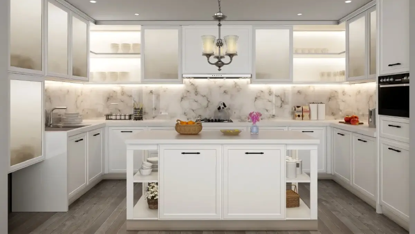
Table of Contents
Introduction
If you have visited two or three model flats in your city recently, you have probably noticed something. The loud reds and heavy dark browns of the last decade are gone. Home designing colour choices across India have shifted towards softer, more lived-in palettes. Warm whites, olives, plaster pinks, terracotta accents and muted blues are the new backdrop in almost every modern Indian home.
But trends alone do not make a good home. The real challenge is picking a house colour design that works for your family, your light and your existing furniture, and still feels contemporary for the next five to seven years. A rushed colour choice during a new home handover is one of the top regrets we hear from homeowners later. This guide covers the interior house colour trends shaping Indian homes in 2026, room-by-room palette recommendations, and the small details to keep in mind when finalising a new home colour design. As a modular furniture manufacturer delivering full home interior projects across cities, we have seen which palettes coordinate well with factory-finished modular furniture.
What Is Driving Indian House Colour Design in 2026?
- Smaller apartment sizes (1BHK and 2BHK dominate new launches), so homes need colours that feel airy
- More time spent at home post-2020, which has made comfort and calm more important than drama
- Modular furniture is becoming standard, so wall colour has to coordinate with factory-finished wardrobes, kitchens and TV units
- A rising preference for earthy, grounded colours that feel rooted in Indian culture without being literal
- Social media exposure to global interior trends, combined with traditional Indian sensibility
Why Interior House Colour Trends Matter for New Home Buyers
- Wall colour is the single largest visual element in every room
- Repainting is inconvenient and expensive, so a good choice saves you from doing it again in two years
- The right colour makes modular furniture look premium, while the wrong one makes it look mismatched
- Colour influences mood, sleep, energy and how natural light reads inside the home
Top Colour Trends for Indian Homes This Year
1. Warm Whites and Creamy Off-Whites
The cool whites of the 2010s have been replaced by warmer whites with a slight yellow or pink undertone. They feel cosier, photograph better in Indian light, and pair with every furniture style.
2. Greige (Grey + Beige)
A restrained, elegant neutral that feels contemporary without being cold. One of the most popular new home colour design choices for urban apartments in 2026.
3. Sage and Olive Green
Calming, natural, versatile. Works on bedroom feature walls, kitchen cabinetry, and study zones. Expect to see this across Indian design magazines throughout the year.
4. Plaster Pink and Peach
Soft, warm, surprisingly universal. Pairs beautifully with wood, brass and white. Increasingly replacing the safe beige of the past.
5. Terracotta and Clay
A warm earthy red-brown that brings Indian warmth into modern interiors. Used on accent walls, pottery, cushions and sometimes kitchen tiles.
6. Muted Navy and Slate Blue
Restful, a bit moody, ideal for bedrooms and reading corners. Pairs with cream upholstery and warm wood.
7. Deep Charcoal
Used carefully, a charcoal wall or kitchen island adds depth. Pairs well with gold or brass fixtures. Best reserved for accent use.
Warm Neutrals That Are Replacing Plain White
Plain white still has its place, but warm neutrals are winning the house colour design conversation in 2026:
- Cream with a touch of yellow
- Ivory with a hint of pink
- Warm beige (not cool grey)
- Soft taupe and sand
- Off-white with a warm undertone
Earthy Accents Shaping Home Design Colour Choices
Earthy accents add character without overwhelming the room. The most effective options for home designing colour choices in 2026:
- Terracotta cushions and throws on a beige sofa
- Mustard yellow chair as a single statement piece
- Olive green feature wall in a bedroom
- Warm clay or brick tone on a study wall
- Sand and sunset tones in curtains and rugs
Cool and Calm Palettes for Modern Indian Families
- Soft powder blue with ivory walls
- Muted navy with cream and wood
- Pearl grey with plaster pink accents
- Sage green with warm white and brass
- Dusty lavender with cream
How to Pair New House Colour Design With Modular Furniture
A new house colour design has to coordinate with the modular furniture going in. Quick pairing guide:
- Warm white walls pair with almost any wood tone and with white or cream modular furniture
- Greige walls pair beautifully with walnut, oak and white laminated furniture
- Sage green walls need a neutral modular piece to balance them
- Plaster pink walls look stunning with warm wood and brass accents
- Terracotta walls need light furniture to avoid feeling heavy
Room by Room New Home Colour Design Guide
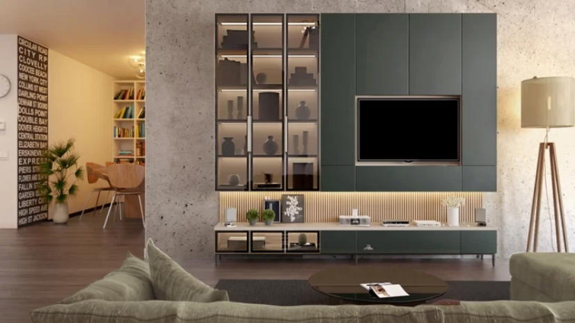
Living Room
Warm white base walls with one feature wall in sage, muted navy or plaster pink. Cream or greige sofa, wooden TV unit, light jute or cotton rug.
Master Bedroom
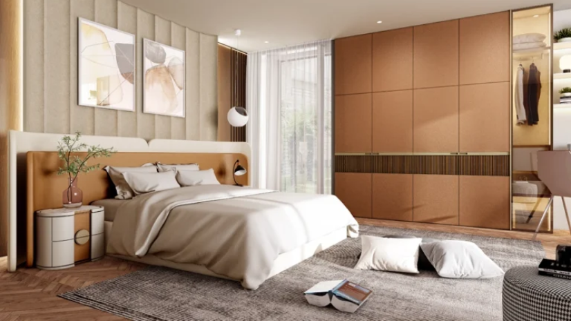
Calm palettes like greige plus powder blue, cream plus muted sage, or warm white plus plaster pink. Avoid high saturation. A white or walnut wardrobe pulls everything together.
Kids Room
Pearl white walls plus a playful accent wall in mint, peach or soft yellow. Keep modular furniture in white or light wood so the accent wall stands out.
Kitchen
Off-white or warm white walls, kitchen cabinetry in white, olive green or warm oak. A pop of colour on the backsplash keeps the kitchen from feeling clinical.
Dining Area
Cream or greige walls, warm wooden dining table, upholstered chairs in sage or taupe. Add one darker element (pendant light, wooden shelf) for anchoring.
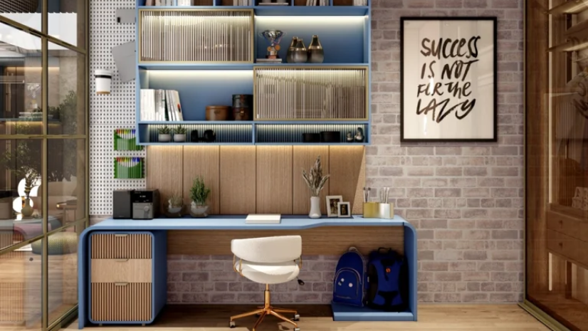
Study and Home Office
Sage green, warm beige, or muted grey walls work well. Pair with a white or oak study table. Avoid strong yellows and reds, which compete with the laptop screen.
Common Colour Mistakes to Avoid
- Picking colours only from catalogue photos instead of testing a patch on your actual wall
- Matching all walls in deep tones, which makes rooms feel smaller and warmer
- Ignoring how much sunlight the room actually gets before choosing a shade
- Using the same paint finish across gloss and matte walls without planning for light reflection
- Forgetting to coordinate the wall colour with the modular wardrobes, kitchen and TV unit
Why Spacewood for a Colour Coordinated Home
Picking a great new home colour design is only half the job. The other half is making sure the modular wardrobes, kitchen, bedroom sets, and doors sit naturally in that palette. Spacewood offers over 200 laminate finishes plus acrylic and PU options to match trending palettes, in-house designers who plan wall colour, feature wall, furniture finish and lighting together, up to 10-year warranty, and factory-finished consistency across large full home projects.
Final Thoughts
The best house colour design is the one that balances what is trending now with what you can live with happily for years. Indian homes in 2026 are moving towards warm, earthy, soft and calm palettes. That is a direction most families are comfortable with because the colours feel natural, restful and flattering to Indian light. Before finalising paint, look at the whole picture, your modular wardrobe, your kitchen cabinets, your flooring, your sunlight. The more you coordinate from the start, the more premium the end result. Talk to the Spacewood team for a full palette and furniture finish plan.
Frequently Asked Questions
What is the most popular house colour design in India right now?
Warm white and greige are leading, followed by sage green, plaster pink and terracotta as feature wall choices. These shades work across apartments, villas and renovations.
Should every room in a new home be a different colour?
Not necessarily. Pick one base colour across most walls and add one or two accent colours through feature walls, furniture or soft furnishings. This keeps the home feeling connected.
Are darker colours suitable for Indian homes?
Yes, used carefully. Deep green, navy, charcoal, and terracotta work beautifully as accent walls, especially in larger rooms or rooms with good natural light. Avoid using dark shades across multiple walls in compact homes.
How often do home design colour trends change?
Interior house colour trends shift slowly. Most palettes stay relevant for four to seven years before a major direction change. Picking from a 2026 trend palette means your home stays contemporary until about 2030 with minor refreshes.
Can I use the same colour on walls and modular wardrobes?
Yes, but keep a subtle tone difference. If the wall is warm white, the wardrobe can be off-white or cream instead of the same exact white. This adds gentle depth.