Best Wardrobe Colour Ideas to Transform Your Bedroom Decor
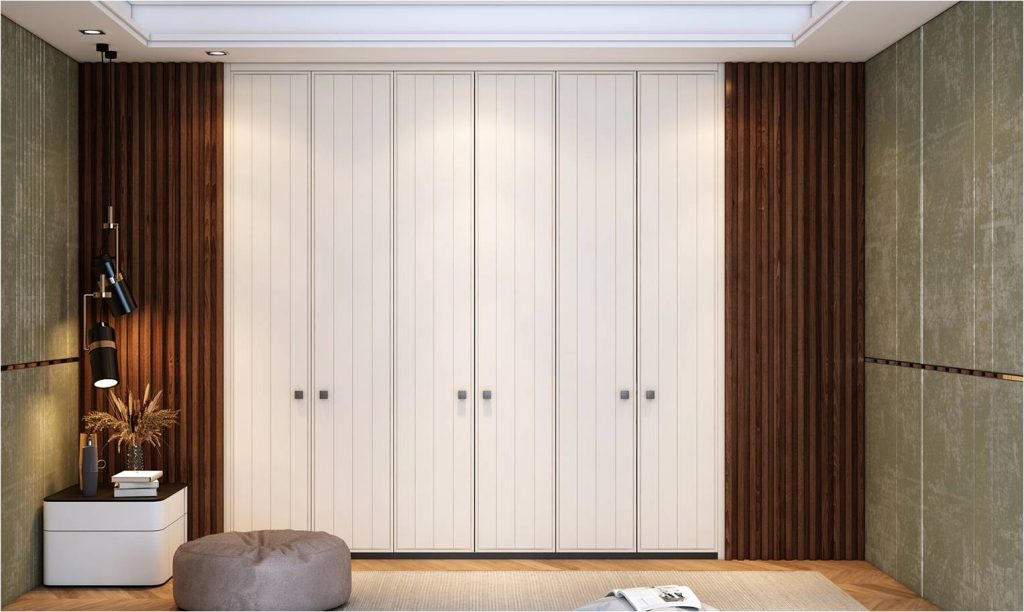
Table of Contents
Introduction
A wardrobe occupies the largest vertical surface in most Indian bedrooms. It is not the bed or the curtains that define the room first. It is the wardrobe. And yet, colour is often treated as an afterthought, decided in the last ten minutes at the showroom. That is where most mistakes happen.
Wardrobe design colors influence how spacious a room feels, how much light it reflects, and even how clean it appears after a long workday. In compact urban apartments, especially in cities like Mumbai or Pune, the wrong shade can make a 10×12 bedroom feel boxed in. In independent homes, darker tones can either look grounded and elegant or heavy and oppressive, depending on execution.
Spacewood has spent 29 years working with over one million customers across India. The brand’s manufacturing base in Nagpur offers a logistics advantage, allowing faster dispatch to western and central India without unnecessary transit delays. Production happens in a controlled factory environment, with European machinery ensuring consistency in finish. That matters when colours need to look the same on every panel, not slightly lighter on one shutter and darker on another.
Colour is not decoration alone. It is engineering, material science, and practical thinking combined. This guide explores wardrobe colour ideas that work in real Indian homes, keeping in mind humidity, dust, lighting, budget, and daily wear and tear.
10 Best Wardrobe Color Combinations For Your Wardrobe
Choosing from the best wardrobe color combinations requires more than scrolling through Pinterest. It requires understanding room size, wall colour, floor tiles, and the kind of light entering the room.
Below are combinations that have consistently worked in Indian households.
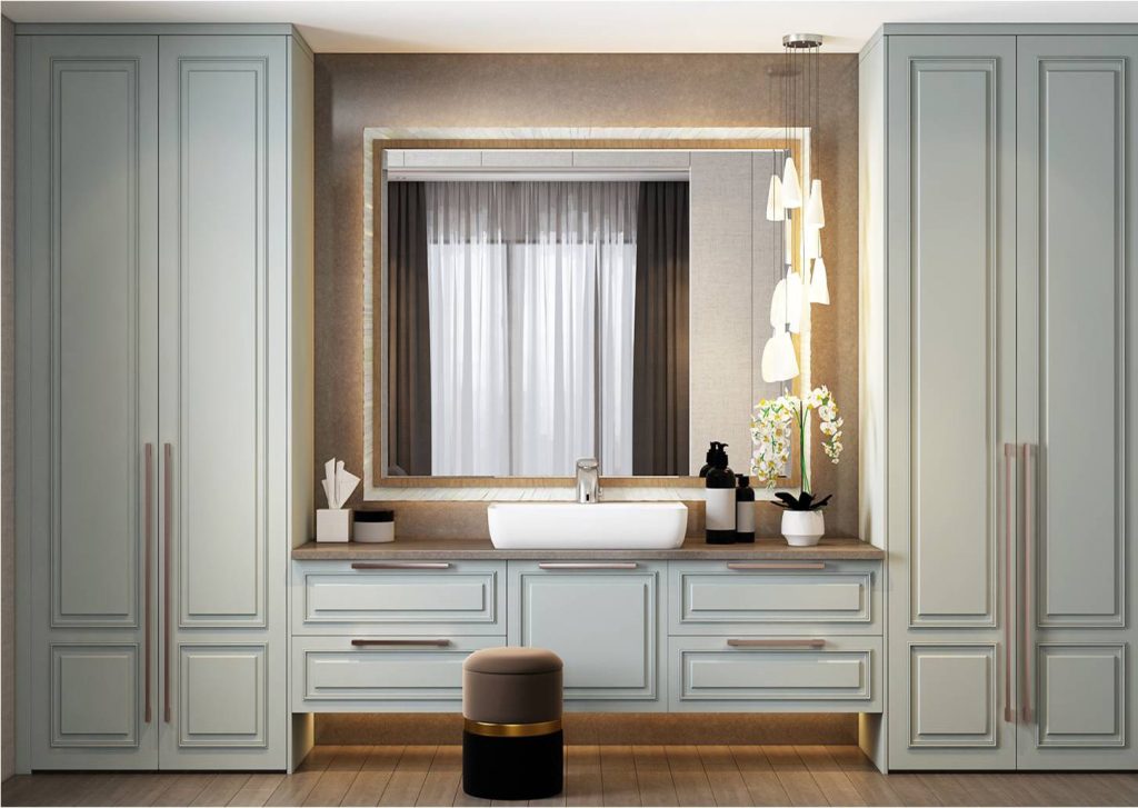
1. White and Warm Wood
The combination of white shutters with light oak or teak-toned panels creates a secure option for wardrobe design. The white color of the rooms reflects light, which creates an illusion of spaciousness in smaller bedrooms. The wood tone creates a warm atmosphere that protects the room from gaining a clinical appearance.
The maintenance of matt white laminates proves easier compared to their glossy counterparts. The gloss finish shows fingerprints, which become especially visible in homes that have children. The use of calibrated plywood, which prevents warping, becomes essential in coastal areas because humidity causes poor-quality boards to swell.
2. Beige and Walnut
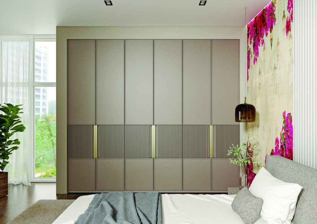
Beige works beautifully against cream walls and vitrified tile flooring. Walnut frames or vertical panels create depth. This combination is often chosen for master bedrooms because it looks mature and understated.
It also hides dust better than pure white. That is a practical consideration most people overlook.
3.Grey and White
Light grey shutters with white loft cabinets create a layered effect. Grey tones are forgiving. They do not show minor scratches easily. In modular wardrobes with sliding doors, this colour pairing looks structured and contemporary without being loud. For apartments with limited natural light, avoid dark charcoal. Stick to mid-tone greys.
4. Navy Blue and Golden
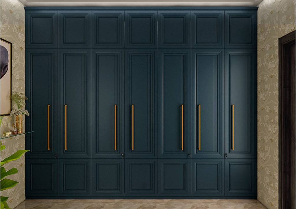
The combination of navy accent panels creates a suitable design for spacious bedroom areas. The design element brings distinctiveness to the area while maintaining a balanced visual impact.
The essential principle requires organisations to maintain an equal distribution of their resources. The excessive presence of blue colour in compact spaces creates an uncomfortable atmosphere. The central shutters should use the navy color, while the adjacent panels need to keep their white appearance according to this design choice.
5. Pastel Green and Wood
The combination of soft sage and pastel green with natural wood tones creates a tranquil atmosphere. The wardrobe color suggestions match bedrooms that face east because morning sunlight brings out the understated shades.
High-traffic rooms should avoid using glossy pastel finishes, according to design guidelines. Daily impacts are managed better by matte finishes than by other types of finishes.
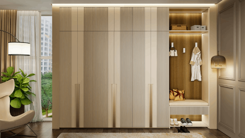
6. Full White with Textured Panels
All-white wardrobes remain popular, especially in urban flats. But plain white can look flat. Adding textured laminate or fluted panels introduces depth without introducing another colour. The key lies in using quality edge banding so the white does not yellow over time.
7. Black and Wood
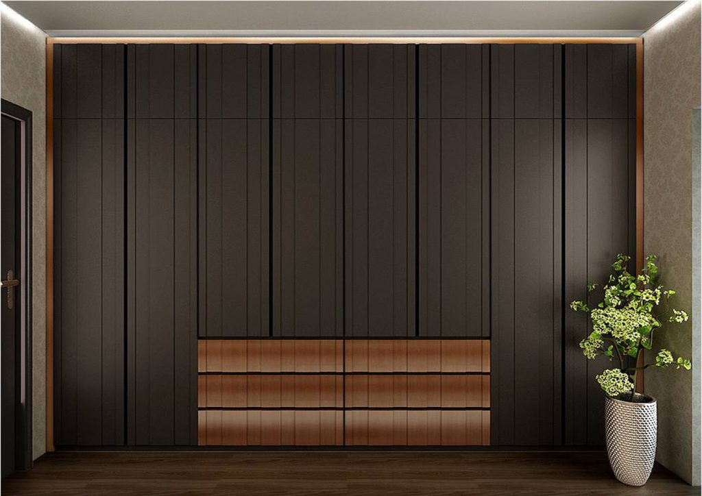
This combination suits larger rooms with good ventilation. Black sliding shutters paired with wooden frames can look strong and defined. However, black shows dust quickly. Homes near main roads or under construction zones may find maintenance slightly demanding.
8. Cream and Bronze Handles
Cream remains a classic. When paired with bronze or brushed gold handles, it looks refined without feeling trendy.
This is among the best wardrobe color combinations for traditional homes with wooden beds and side tables.
9. Dual-Tone Brown
The combination of light brown upper cabinets and dark brown lower shutters creates a gentle contrast between two different things. The solution works effectively for homes that have children because its darker lower panels conceal shoe scuff marks. The contrast in modular installations creates two different visual effects that break the tall height of wardrobes.
10. Soft Blue
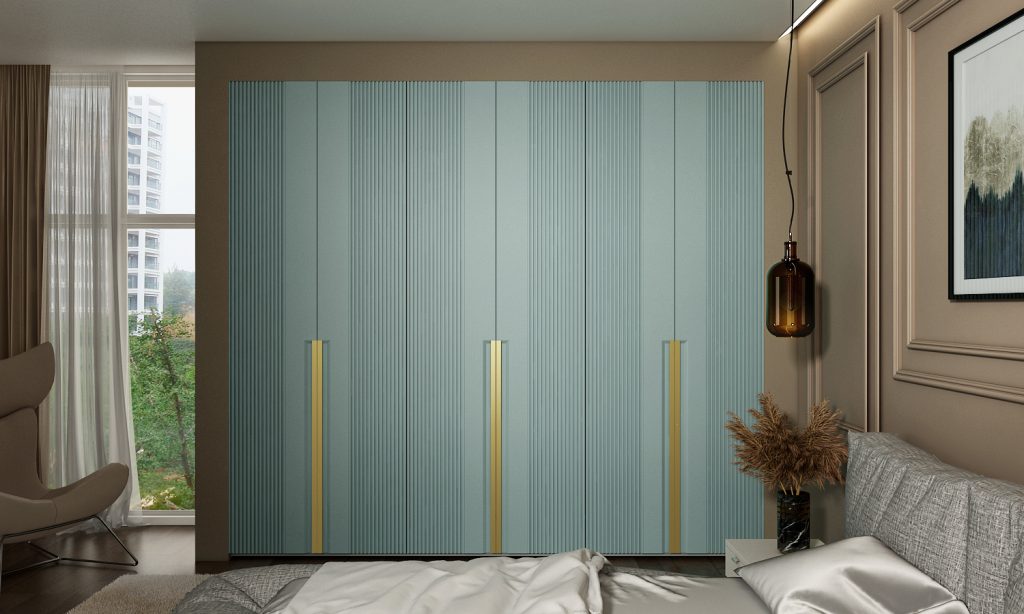
Soft blue shutters with golden handles bring brightness without intensity. Ideal for guest bedrooms or children’s rooms. Care must be taken to match the blue with the wall paint. Even a slight mismatch can look unintentional.
The wardrobe design colors achieve their purpose because they maintain equilibrium between visual appeal and practical application. Spacewood’s factory-controlled manufacturing system guarantees that all panels will have matching laminate finishes and color patterns, which become essential for dual-tone design.
Vastu-Approved Bedroom Wardrobe Colour Combination for Positive Energy
Many Indian homeowners still consider Vastu when they choose wardrobe design colours. Certain shades are traditionally preferred because they create better harmony than the other available colours.
The common recommendation for southwest-oriented wardrobes includes light shades, which consist of cream and beige, light green, and soft brown. The tones create stability, which results in grounding energy.
Dark red and bright orange are usually avoided for wardrobes. These colours can feel aggressive in enclosed bedroom spaces. And practically speaking, they also limit future décor changes.
For north-facing rooms, light blues and whites are considered suitable. They reflect available light and prevent the room from feeling cold.
The principles of Vastu alignment require assessment of building materials, which should not be disregarded. The wardrobe design creates more problems through its use of inferior materials, which expand more during the monsoon than any color choice. The selection of moisture-resistant boards with proper edge sealing becomes critical for regions experiencing high humidity throughout the year.
Spacewood operates its modular systems production from its Nagpur facility. The consistency of that element enables different bedroom units to achieve identical finishing results throughout their spaces.
Vastu-compliant wardrobe colour ideas should be viewed as guiding principles, not rigid rules. The final choice must still suit the room size, lighting, and family lifestyle.
Colour decisions cannot be separated from usage patterns. Bedrooms used by working professionals often need tones that look fresh even after long hours and limited daylight. Light greys, whites, and muted woods tend to work better.
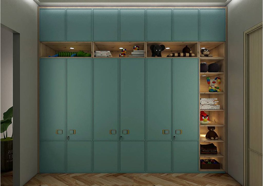
Children’s rooms demand durability. Lighter shades show crayon marks easily. Semi-gloss laminates can be wiped clean, but too much gloss highlights scratches. In rental properties, neutral wardrobe design colors increase resale and rental value. Bold personal colours may not appeal to future occupants.
Budget also plays a role. Certain imported laminates and acrylic finishes increase cost significantly. Indian laminates, when chosen from reliable manufacturers and pressed under proper factory conditions, provide comparable durability at a better price point.
Storage design influences colour perception as well. Large, uninterrupted shutter surfaces in dark tones can feel overwhelming. Breaking panels with open niches or mirrors helps balance the look.
Most homeowners do not realise that lighting temperature affects colour appearance. Warm LED lighting makes beige look richer. Cool lighting makes grey look sharper. It is important to test samples inside the actual room before final approval.
Why Manufacturing Quality Affects Colour Longevity
The color of a wardrobe exists as a combination of its material properties. Low-pressure laminates experience irregular color loss throughout their surface. The defective edge banding system enables moisture penetration, which results in wood swelling. The panel distortion becomes visible during the monsoon season in cities that experience heavy rainfall.
Spacewood produces wardrobes by operating a factory that uses European machines for precise cutting and uniform pressing operations. The process delivers consistent results because it applies standardised methods to every panel production. The advantage of being based in Nagpur is logistical efficiency. The products travel to different states with minimal handling, which decreases the risk of damage during transportation.
Consistent colour matching across modular units is not a minor detail. When loft cabinets and lower shutters differ slightly in shade, the entire room looks compromised. Durability protects colour investments. A shade chosen carefully should not look tired in three years.
Conclusion
Selecting the right wardrobe design colors requires more than picking a trending shade. It requires assessing room size, light direction, daily usage, maintenance capacity, and long-term value.
The best wardrobe color combinations are those that look good on day one and still feel appropriate years later. Neutral tones with thoughtful accents tend to age better than bold experiments. Texture often adds more character than loud colour.
A wardrobe occupies a permanent position in a bedroom. Its colour choice deserves deliberate thought, not impulse selection. When selected wisely, it enhances space perception, simplifies maintenance, and supports everyday living without demanding constant attention. Connect with us to explore options suited to your space.
Frequently Asked Questions
Which wardrobe design colors make a small bedroom look bigger?
Light shades such as white, beige, and light grey reflect more light and create an open feel. Avoid very dark tones in compact rooms.
Are dual-tone wardrobes better than single-colour wardrobes?
Dual-tone wardrobes add visual interest and can break monotony, especially in tall installations. However, colours must be balanced carefully to avoid a cluttered appearance.
Do dark wardrobe colour ideas require more maintenance?
Yes. Dark shades like black and navy show dust and fingerprints more easily compared to mid-tone or light finishes.
How important is laminate quality in maintaining the wardrobe design colour combination?
High-quality laminates pressed under controlled factory conditions resist fading and peeling. Poor-quality materials may discolor over time, especially in humid climates.
Can Vastu influence wardrobe colour selection?
Many homeowners prefer light and earthy tones as per Vastu recommendations. However, practicality, room lighting, and durability should also guide the final choice.