Best Summer Colours for Home Interiors: Cool, Calm and Timeless Palettes
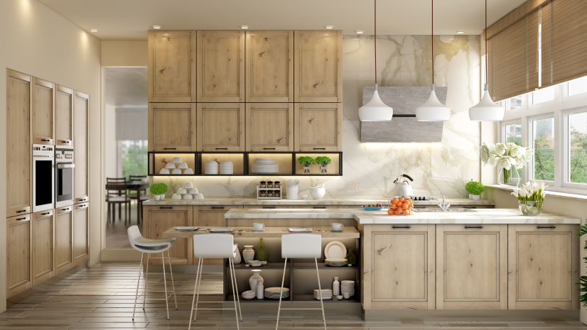
Table of Contents
Introduction
Indian summers are long, bright, and often relentless. That changes the way we think about colours for home interiors. A shade that feels warm and cosy in December can feel heavy by April. Picking summer-friendly wall and furniture colours is not just an aesthetic call. It affects how cool the room actually feels when the afternoon sun hits at full force.
Summer interiors work best when the palette reflects light, stays visually cool, and matches your existing furniture. In 2026, the latest room color direction is moving towards softer, breathable tones rather than bold experiments. Think pale sage, warm whites, sand beige, powder blues and soft pinks instead of heavy jewel tones. As a modular furniture manufacturer working across full home interior design projects, we have seen which palettes hold up across Indian summers and which ones do not.
Why Summer Colours for Home Interiors Matter
Colours affect how hot or cool a room feels, perceptually if not scientifically. A few reasons this matters in Indian homes:
- Light shades reflect sunlight, so the room does not absorb heat visually
- Cooler tones (soft blue, sage, mint, grey) calm the eye during harsh afternoons
- A cluttered or dark palette in April feels very different from the same palette in December
- Summer is the season most families start renovations, so getting this right pays off for the next 12 months
What Makes a Good Summer Palette?
- One light base: usually off-white, cream, ivory, or warm white across most walls.
- One soft accent: sage green, powder blue, plaster pink, or sand beige on one feature wall or the headboard wall.
- One warm grounding tone: in furniture or flooring, so the room does not feel flat. This is where your wooden TV unit, rattan chair, or wooden wardrobe comes in.
Best Summer Colour Palettes for Indian Homes in 2026
1. Warm White + Soft Sage
Walls in warm white, one feature wall in soft sage green, a white modular wardrobe, light wooden floor. Fresh, calm, perfect for bedrooms that get strong afternoon sun.
2. Ivory + Powder Blue
Walls in ivory, curtains in powder blue, cream sofa. A coastal feel that suits Mumbai, Chennai, and Kochi homes.
3. Cream + Plaster Pink
Cream base walls, one feature wall in plaster, pink, rattan, or light wood furniture. Softly feminine and warm. Great for master bedrooms.
4. Greige + Sand Beige
Greige (grey-beige) walls, sand beige curtains, warm wooden dining table. One of the most popular modern interior house colors for open-plan homes.
5. Pearl White + Muted Mint
Pearl white walls, mint green bedspread, white study table. Best for kids’ rooms and nurseries where you want fresh without being baby-ish.
6. Soft Taupe + Cream
Soft taupe on one wall, cream on others, walnut or oak coffee table. Elegant and easy to live with.
What Are the Most Popular Modern Inside House Colors?
Across Indian homes in 2026, these modern interior house colors keep coming up:
- Warm white and off-white (easy to live with, pairs with anything)
- Greige (a greyed-out beige that feels fresh but not cold)
- Sage and olive green (calming, works well in bedrooms and studies)
- Muted navy and slate blue (restful, especially for master bedrooms)
- Plaster pink and peach (soft warmth without being traditional)
- Terracotta (accent only, adds Indian character)
- Pearl grey and pale taupe (luxury feel without drama)
Room by Room: Which Color for Which Room in the House Works Where?
The right color for a room in the house choices vary by function:
Living Room
Warm white or ivory base with one accent wall in sage, plaster pink, or slate blue. Keep the ceiling white. Pair with a neutral sofa and wooden furniture.
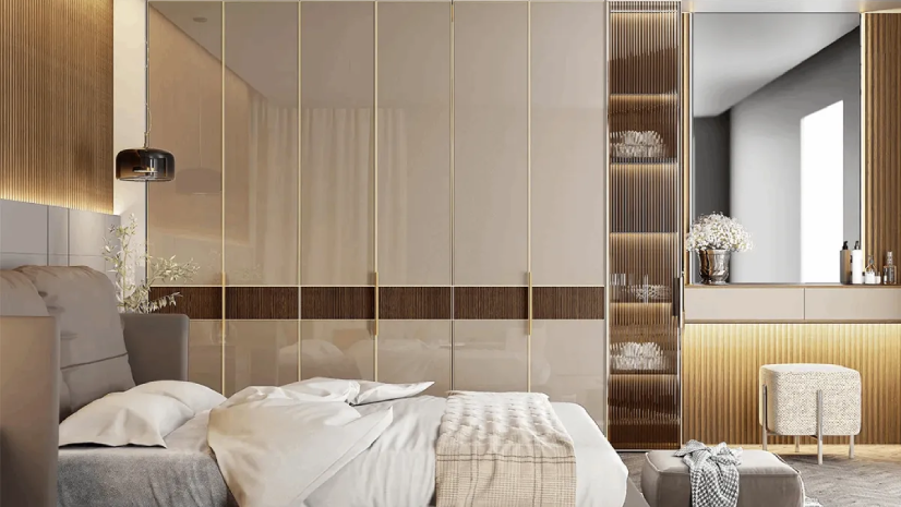
Master Bedroom
Soft, calm palettes like greige plus powder blue, or cream plus muted mint. Avoid strong reds or oranges on the headboard wall because they interfere with sleep.
Kids Room
Pearl white base with one playful feature wall in mint, peach, yellow pastel, or soft lavender. Keep the palette clean so toys and artwork do the colour work.
Kitchen
Off-white and soft wood are classic for Indian kitchens. Add a warm tile or a light green backsplash for an energetic but clean look.
Dining Area
Cream or warm beige walls, a slightly darker rug or dining chair upholstery, and a statement wooden dining table. Inviting but not overheated.
Study / Work Zone
Sage green or muted grey walls work best for focus. Avoid stark white because screen glare and wall glare combined can tire the eyes.
Latest Room Colour Trends That Will Not Age Fast
Some trends come and go, but a few of the latest room color directions are expected to stay relevant for years:
- Soft earthy neutrals (taupe, greige, sand) instead of stark greys
- Muted greens, from sage to olive, replacing cool greys
- Plaster pink as the new beige
- Warm whites instead of cool whites, because they suit Indian skin tones and lighting better
- Two-tone walls with a light upper half and a slightly deeper lower half
How to Pair Summer Colours With Modular Furniture
- Light walls with light wardrobes (white or cream) make small rooms feel airy
- Light walls with warm wood wardrobes or TV units add a gentle contrast
- Greige walls pair beautifully with both white and walnut modular furniture
- Sage or blue feature walls look stunning with a plain white wardrobe or TV unit
- Avoid all-matching palettes. One element of contrast keeps the room from feeling flat
Finishes, Sheens, and Lighting Considerations
- Matte or eggshell paint finishes are gentler on the eye than full gloss
- Warm white LED bulbs (3000K) show summer colours more accurately than cool white bulbs
- Avoid dark matte accent walls in poorly ventilated rooms
- Test your chosen colour in a 2×2-foot patch on the actual wall before committing
Common Mistakes to Avoid
- Picking a colour purely from a Pinterest image without checking Indian light conditions
- Painting every wall in a bold shade, which traps heat visually in summer
- Matching the wall colour exactly to the furniture colour, which removes all contrast
- Ignoring the ceiling. A fresh white ceiling instantly lifts a warm-toned room
- Using high-gloss enamel paint on large living room walls, which creates summer afternoon glare
Why Spacewood for Your Home Interior Setup
Wall colour is only part of a home’s palette. Spacewood’s modular wardrobes, modular kitchens, and modular full home solutions come in laminates, acrylics, and veneers across the range that match most paint palettes you plan for summer. Up to a 10-year warranty keeps the colour stable well beyond the first few seasons. 11,000+ delivered projects means we know which palettes age well in Indian climates.
Final Thoughts
The right summer colours for home interiors are the ones that keep your home feeling cool, calm, and uncluttered through the hottest months without sacrificing warmth or personality. Lean towards soft base shades, add a gentle accent, and match the palette to your furniture. If in doubt, pick a tone a shade lighter than you think. Indian summers are always brighter than the swatch suggests. Need help coordinating wall colour, curtains, and modular furniture? Reach out to Spacewood for a full home palette plan.
Frequently Asked Questions
What are the best summer colours for Indian homes?
Warm white, ivory, greige, sage green, powder blue, plaster pink, and sand beige are the most reliable summer colours for Indian homes because they reflect light, feel cool, and pair with a wide range of furniture.
Which color for the room in the house feels coolest in summer?
Soft blue, pale sage, and pearl grey consistently feel the coolest because they read as cool tones. Pair them with white ceilings and light flooring for maximum effect.
Should the ceiling always be white?
For most Indian rooms, yes. A white ceiling visually lifts the room, reflects light, and keeps the wall colour reading correctly. The only exception is very high ceilings, where a slightly darker ceiling can add intimacy.
What are the latest room color choices in 2026?
Greige, plaster pink, sage green, muted navy, warm whites, and soft taupes are dominating 2026 palettes. These are expected to stay popular for several years.
Can I use dark colours on a feature wall in summer?
Yes, if the wall is small and the rest of the room stays light. Deep green, navy, and charcoal on a single accent wall can actually feel cool in summer because of the contrast.