

Soothing Colours for Home: The Best Color Combination for House Interiors
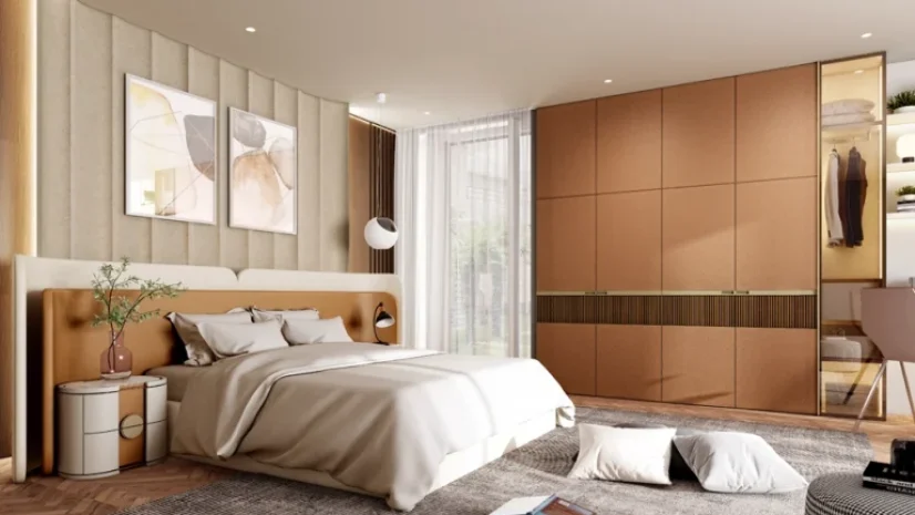
Table of Contents
Introduction
A calm home is rarely an accident. It comes from choosing the best color combination for house interiors and then letting the furniture, flooring and light agree with it. Colour changes how large a room feels, how well you sleep and how fresh the kitchen looks at 7 am. Spacewood has furnished over a million Indian homes in 29 years, so we see daily how walls and wood tones work together. This guide walks room by room: the best colors for bedroom walls, the best colors for kitchen spaces, and one interior room color combination method you can use anywhere.
Why Do Soothing Colours Matter in Home Interiors?
Colour psychology is simple and consistent: soft greens echo nature and lower visual stress, muted blues calm the mind and even reduce heart rate, and warm neutrals like beige and ivory make rooms feel settled and spacious. The catch most people miss is that furniture can amplify or cancel the effect: a soothing sage wall loses its calm next to a high-gloss red wardrobe, while the same wall with light oak furniture feels like a retreat.
What Is the Best Color Combination for House Interiors?
If you want one palette flowing through the whole home, these four schemes are the best color combinations for house interiors we recommend most:
- Sage green + ivory + walnut wood: fresh yet grounded; suits every room from living to study.
- Warm beige + off-white + light oak: the safest whole-house scheme for compact flats.
- Soft grey + blush + white: contemporary and airy; pairs well with matte laminates.
- Powder blue + cream + teak: cool walls balanced by warm classic wood tones.
Pick one and repeat it with different proportions in each room – that repetition, not matching everything exactly, is what makes the best color combination for house interiors feel designed rather than decorated. Our interior house colour trends guide shows how each best color combination for house styles looks across real Indian homes.
What Are the Best Colors for Bedroom Walls?
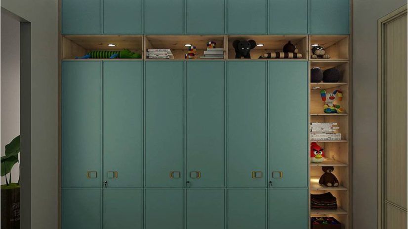
Sleep research and Vastu agree here: the best colors for bedroom walls are muted, low-contrast and warm-leaning, and the best colors for bedroom walls in small rooms are also the lightest ones. Sage green, powder blue, warm beige and muted lavender top the list, while bright red, pure black and neon shades are best avoided where you sleep. Two rules make these work: keep the ceiling white, and pair light walls with deeper furniture – or the reverse. An ivory wall behind a walnut bed and wardrobe is the classic Indian pairing; if your wardrobe is white or pastel, deepen the wall a shade so the room does not wash out. That furniture balance is what separates the best colors for bedroom walls in real homes from the ones that only work in catalogues. Choosing shutters too? See our wardrobe colour ideas for combinations that flatter each wall shade.
What Are the Best Colors for Kitchen Walls and Cabinets?
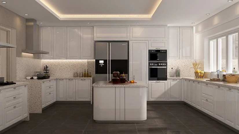
Kitchens are where soothing meets practical. The best colors for kitchen walls are light and heat-friendly – soft white, cream, pale sage and muted yellow keep the space bright and appetising. As per Vastu, the best colors for kitchen corners lean warm to honour the fire element, while black is best avoided. The modern move is a two-tone scheme: calm walls with colour on the cabinets. Think white walls with olive or wood-grain shutters, or cream walls with a deep-blue island – the best colors for kitchen cabinets can carry more depth than the walls precisely because the walls stay calm. Because cabinets cover more visual area than walls in a modular kitchen, choose the cabinet shade first and let the wall support it – our modular kitchen designs range shows these pairings in real finishes.
How Do You Choose an Interior Room Color Combination for the Living Room?
Use the 60-30-10 rule – the simplest interior room color combination method professionals rely on. Give 60% of the room to a soothing base (walls and large furniture), 30% to a secondary tone (curtains, TV unit, rug) and 10% to an accent (cushions, art, a single feature wall). In practice: ivory walls, a walnut TV unit with grey sofa, and terracotta cushions. If you want a bolder wall, limit it to one – our guide to colour combinations for walls shows feature-wall pairings that stay soothing rather than loud. The same interior room color combination logic scales down to bedrooms and even balconies.
How Should Wall Colours Match Your Furniture?
This is the step paint guides skip. Wood tones are colours too, and every palette must include them:
- Walnut and wenge (dark woods): pair with ivory, sage and blush walls for contrast.
- Oak and beech (light woods): pair with deeper walls – olive, slate blue, warm grey.
- White and pastel laminates: pair with warm neutral walls to avoid a clinical look.
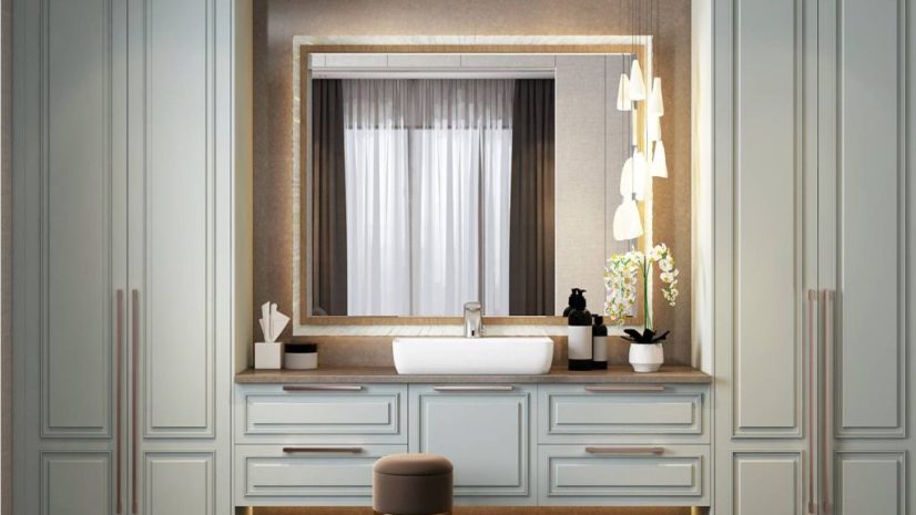
When walls and furniture sit within the same warmth family, any interior room color combination instantly looks intentional – which is why an interior room color combination should be finalised with furniture finishes in hand. Explore how full bedroom sets carry a palette across bed, wardrobe and dresser, and how seasonal accents refresh it – our summer colours guide has easy swaps.
Quick Cheat Sheet: Soothing Combinations by Room
- Living room: ivory + sage + walnut – the safest interior room color combination for shared spaces.
- Bedroom: powder blue or sage with cream – the best colors for bedroom walls when sleep is the priority.
- Kitchen: cream + pale sage + wood-grain cabinets – the best colors for kitchen walls that stay fresh-looking.
- Whole house: warm beige + off-white + oak – the best color combination for house resale value as well.
Which Colour Mistakes Should You Avoid?
- Painting every room a different family of shades – it breaks the interior room color combination flow between spaces.
- Judging a shade from a 2-inch swatch – test a one-metre patch and watch it in morning and evening light.
- Ignoring furniture tones – even the best colors for bedroom walls fall flat beside a clashing wardrobe finish.
- Going dark in a small kitchen – the best colors for kitchen spaces stay light because heat, smoke and spice already add visual weight.
- Using more than three colours in one room – soothing palettes live or die by restraint.
Conclusion
Soothing homes follow three moves: one repeating palette as the best color combination for house flow, muted low-contrast shades as the best colors for bedroom walls, and light heat-friendly tones as the best colors for kitchen spaces – all anchored by wood tones that agree with the walls. Get the 60-30-10 proportions right and calm follows. Ready to match furniture finishes to your palette? Talk to a Spacewood expert for shade-matched modular designs.
Frequently Asked Questions
Which colour is most soothing for a home?
Sage green, powder blue, warm beige and ivory consistently rate as the most calming. Sage green is the most versatile – it suits every room and both light and dark furniture.
What is the best color combination for house interiors?
Sage green with ivory and walnut, or warm beige with off-white and oak. Repeat one palette across rooms in different proportions for a cohesive, designed feel.
Which are the best colors for bedroom walls for good sleep?
Muted, low-contrast shades – sage, powder blue, lavender and beige. Avoid bright red, neon tones and pure black, which are too stimulating for a sleep space.
Which are the best colors for kitchen as per Vastu?
Soft white, cream, pale yellow and light sage work best; warm tones suit the kitchen’s fire element, while black is generally avoided.
What wall colours go best with wooden furniture?
Dark woods like walnut pair with ivory, sage and blush walls; light woods like oak pair with olive, slate blue and warm grey. Keep walls and wood in the same warmth family.